Showing posts with label Colour Correction. Show all posts

Wednesday, 15 May 2013

Relapse- Final Video!


SHOOTING LOCATIONS

 WEATHER
during filming in the first week, i got some amazing scenes and footages. The sun was bright and everything looked pretty good and well lit. 
Second week of filming the snow was cleared and ended up shooting the second half of the story. When editing i could not use the snow scenes as story was supose to take place in one day.


It was such a shame to cut these scenes out and not use them. They were key part of the story and so i had to use the scenes i had without the snow and mirror them when i reuse them to fill the missing scenes. that i cut off.


i had used some low angle shots (macro) and different angles for each take and in the end i did not use them because the audience will see the snow in scenes and others didnt.


TIME OF THE DAY


Friday, 10 May 2013

Untitled Story- Refined Colour Correction


When i finished rendering my final video with colour correction. I double checked make sure nothing missing. Then wheb i got home and viewed it again over the big screen tv i noticed the whole video became darker. I was surprised to see this as i checked and knew before i left university where i was doing my rendering, it looked fine. 
I decided that next day i will improve on the colour correction and brightness to fix this problem. 


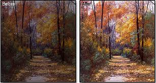
So the picture above shows the refined version before and after. ( left to right) i noticed by increasing the reds a litte on the curves effect and reduce the blue brightens the picture a little and add a nice touch of warm colour. but still not loose the cold blue/greenish tone look.  


When i increase the brightness it reduces the quality of the video and the darker shadowy parts become grainy, it becomes less constrast and looks washed out. so i did not end up using brightness and constract effect.


For the part where the character feels dizzy and flashbacks are about to start, i did a test of distorting the video to show how he feels and sees, using a first person angle. 


When i re did the scene again i wanted to  do the same effect but use the first person shot minimal and to only show the starting point of him feeling the effect of dizzyness and lighth-headedness.


Thursday, 9 May 2013

Untitled Story- Colour Correction Research


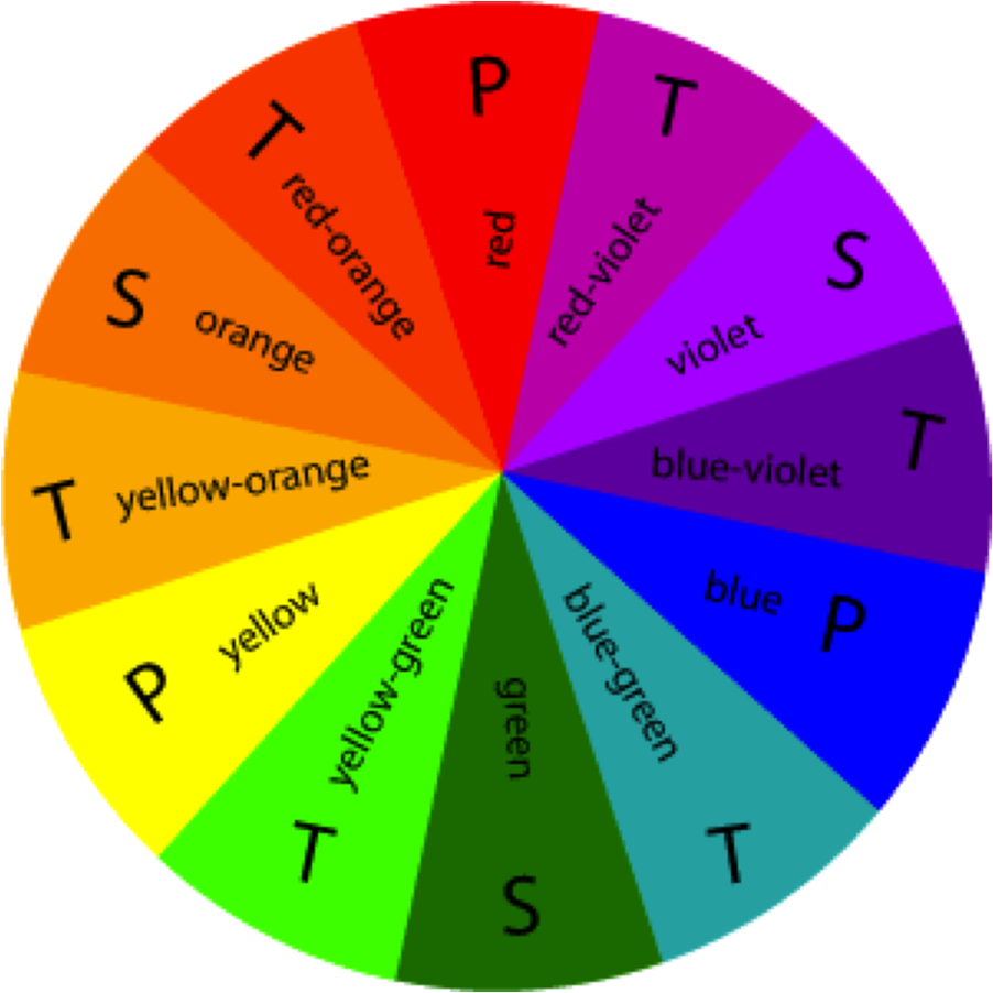
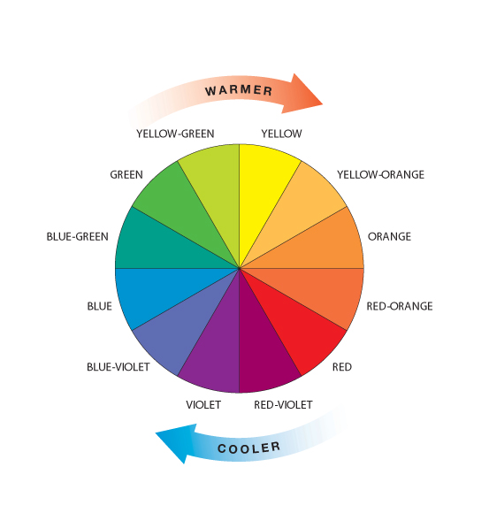
When researching about colour correction, I have to first know about what colours go with what. I looked at colour wheel which gives you the palette and what colours compliments which. This was very helpful in knowing the tone and the look of what I wanted to go for.


For the present time I wanted something dull and less interesting, lifeless. And for the flashbacks It was going to be more vibrant and colourfull, increase the colours and maybe add a little gaussian blur effect to the flashback to give that dreamy shiny look. I want my audience to see how happy his memories were/are and how different it is now, and wonder what happened. Even though I'm not going to explore what has happend to the character, the ending and flashbacks should somehow tell you. In the end you get to realised it was the hospital he was in at the beginning and you get to see the woman by the window is the nurse that saved him in the end.


The Video below is my first colour correction test I did. The feedback I got was to make it easier for the audience to tell apart the flashback to the real time events.
So What I did was colour correct individually all the present scenes to look same and the flashback to have a different colour scheme.  I will upload the updated version on another post. 


Untitled Story- Colour Correction

Colour Correction/ Grading is one of the funnest part to do in editing. I started doing this in my second year when working on advertisement project about Hydration. I did a colour correction for it and I quite enjoyed the process to make the video and the colour pop or show the mood you want to show on the video. If its post apocalyptic world then it is normally less saturated and more dull colours. For happy scenes it is colourfull and vibrant.


 If its post apocalyptic world then it is normally less saturated and more dull colours. For happy scenes it is colourfull and vibrant.


Saturday, 6 April 2013

Journey- Final Cut

t

This is my final cut edit I did for my short s tory about journey. I did some colour correction . Tested out different colour tones and tint. Then for a cinematic look I added the famous black bars top and bottom for a widescreen look.
Also added some lense flares to add the cinema look and add a bit of class to the look.

Journey- Editing In After Effects


Here i was trying to stretch the time and figure out how much time each shot will use before cutting to another angle and view.


After timing them i would add colour correction using curves and tint effects and then later add some lens flares to give a cinematic look


i did some research about the cinematic look and the aspect ratio and black vars. Then i used the action title safe guide and made custom wide screen look


Then spent more time colour correcting and bringing the vibrance up and highlight some colours like the blues and reds. i reduced the green by a touch to give a cooler feel to it. 


Here this footage i took i did not use a steadycam, i ended up using the camera hand held and shoot this scene while moving really quickly. My hand was shaking and the video looked bad and unstable. i decided to find a way to track and reduce the shaking. i used stabilise motion tracker and track the rotation and   motion. X and Y. 


it resulted in a better footage but problem was because it was too shaky, the would be black bars coming in and out the action frame.which means i had to zoom in a lot to not see them. i startes off a medium shot and ended with close up.