
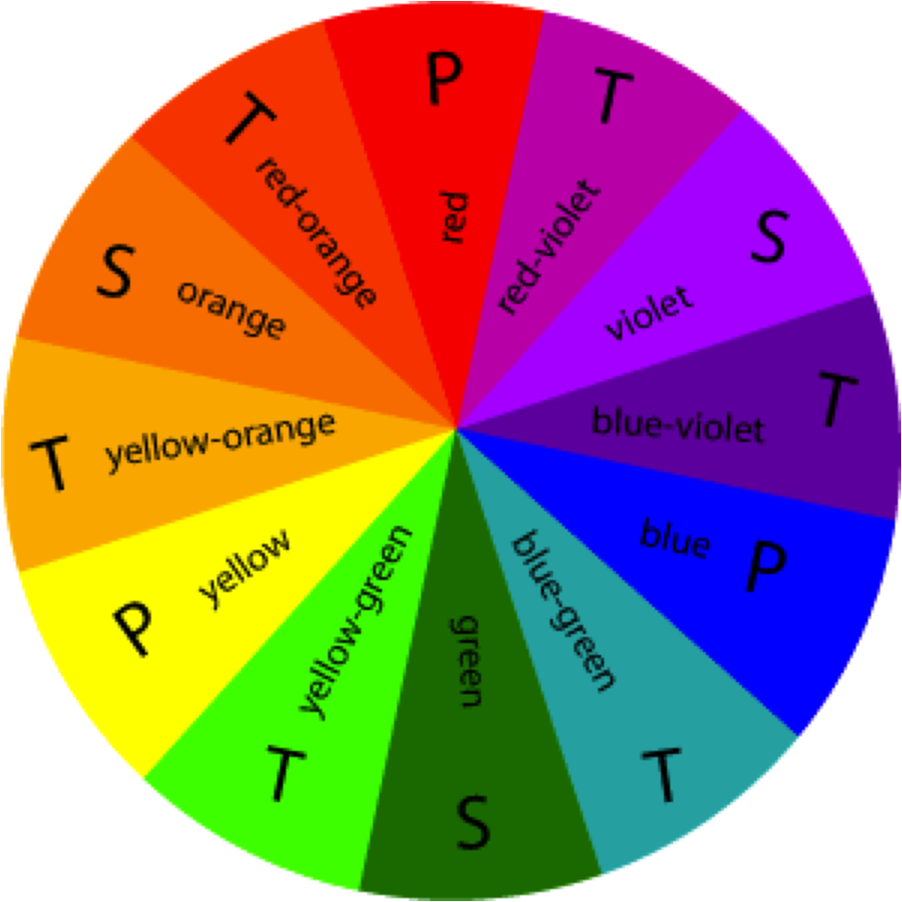
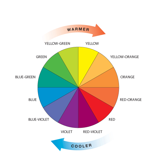
When researching about colour correction, I have to first know about what colours go with what. I looked at colour wheel which gives you the palette and what colours compliments which. This was very helpful in knowing the tone and the look of what I wanted to go for.
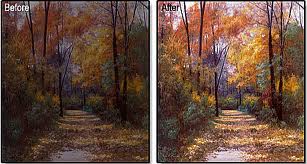
For the present time I wanted something dull and less interesting, lifeless. And for the flashbacks It was going to be more vibrant and colourfull, increase the colours and maybe add a little gaussian blur effect to the flashback to give that dreamy shiny look. I want my audience to see how happy his memories were/are and how different it is now, and wonder what happened. Even though I'm not going to explore what has happend to the character, the ending and flashbacks should somehow tell you. In the end you get to realised it was the hospital he was in at the beginning and you get to see the woman by the window is the nurse that saved him in the end.


The Video below is my first colour correction test I did. The feedback I got was to make it easier for the audience to tell apart the flashback to the real time events.
So What I did was colour correct individually all the present scenes to look same and the flashback to have a different colour scheme. I will upload the updated version on another post.
Thanks for sharing this information and beautiful picture.. They are really stunning... You did a great job.
ReplyDeletecolour correction in DMT