Thursday, 16 May 2013

Cinematography Research


                 RUBY SPARKS- Matthew Libatique

In the movie ruby Sparks, the main character is a wrier and he has to come up with a story quickly. Everytime he passes out or sleeping he always dreams about the same dream and a girl but he cant see her, she is always blurred out. Every time he dreams he gets closer to seeing her face and he ends up waking up due to his alarm set off or something woke him up.


I love how vibrant the colours are during his dreamy sequences and shows a happy thought and memory. I wanted something like this for the flashback sequence. 


I have a similar scene like this i shot outside in the park,  and for my flashback i will make this scene more colourful and add a glow to it to give it a dreamy feel.


                          PROMETHEUS- Dariusz Wolski

I love prometheus cinematography, it is very clean but the colours are  beautiful. throughout the movie the cinematography look is like the matrix, it has a green tint to it. And for this I was thinking to use it for my short film


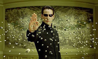
MATRIX RELOADED- Bill Pope
the matrix has a green look to it, most outdoor scenes have more greens and blues and less warm colours. I did something similar to this in the first test i did with my classmate andy as the main character.


                THE SOCIAL NETWORK- Jeff Cronenweth
The Social network is similar to matrix, but this is more of a David Fincher look to all of his films. He always have the same cinematography and this is one of the things that makes his a memorable auteur.


SHAME- Sean Bobbitt


Wednesday, 15 May 2013

Relapse- Final Video!


SHOOTING LOCATIONS

 WEATHER
during filming in the first week, i got some amazing scenes and footages. The sun was bright and everything looked pretty good and well lit. 
Second week of filming the snow was cleared and ended up shooting the second half of the story. When editing i could not use the snow scenes as story was supose to take place in one day.


It was such a shame to cut these scenes out and not use them. They were key part of the story and so i had to use the scenes i had without the snow and mirror them when i reuse them to fill the missing scenes. that i cut off.


i had used some low angle shots (macro) and different angles for each take and in the end i did not use them because the audience will see the snow in scenes and others didnt.


TIME OF THE DAY


Tuesday, 14 May 2013

Relapse- Title Animation

 i had not thought about title during my filming and stoyboarding. I left this till the end because i wanted to see the final look and the tone shown of the final video and then think of an appropriate title for my short film. 

i did not want to name it something obvious that will tell the audience or gove away what the story is about. But i also wanted a title that is relevant and to have a meaning that when someone sees the video will see the title is perfectly named.

I started asking couple people for title ideas and all seemed to be coming up with similar titles. As i was showing Laura the work i did for her for feedback, i mentioned my short story plotline and asked her for name suggestion. She came up with "Relapse". i thought it was brilliant and not too revealing but same time it is a description of the story. 


Friday, 10 May 2013

Post Production- Masking


The video above was the first test i did for Laura to do post production work for her. It had a lot of problems for me to fix and ended up having a bac outcome. The camera was not in focus in most of the time and blurryness everywhere. Also lighting was huge issue for me when editing it. I could not do anything about it.      


Then i had asked her to re shoot the video again and this time to do it slower pace and lighting to be consistant. also the camera to focus on everything. I thought it would be easier to add blurr and focus in post using after effects and lighting too. change exposure and keyframe them to have similar effect as the first one looking like lighting and thunder and windy blowing the house.


i had similar problems with this as the first video. lighting changes in couple of frames and it affects the masking when video moves to those frames, you can see the harsh lines from masking. i tried playing a round with the opacity and feathering but it made it worse and looking more obvious that it was masked out and that something used to be there.


Post Production- Cloning


Post Production


Untitled Story- Refined Colour Correction


When i finished rendering my final video with colour correction. I double checked make sure nothing missing. Then wheb i got home and viewed it again over the big screen tv i noticed the whole video became darker. I was surprised to see this as i checked and knew before i left university where i was doing my rendering, it looked fine. 
I decided that next day i will improve on the colour correction and brightness to fix this problem. 


So the picture above shows the refined version before and after. ( left to right) i noticed by increasing the reds a litte on the curves effect and reduce the blue brightens the picture a little and add a nice touch of warm colour. but still not loose the cold blue/greenish tone look.  


When i increase the brightness it reduces the quality of the video and the darker shadowy parts become grainy, it becomes less constrast and looks washed out. so i did not end up using brightness and constract effect.


For the part where the character feels dizzy and flashbacks are about to start, i did a test of distorting the video to show how he feels and sees, using a first person angle. 


When i re did the scene again i wanted to  do the same effect but use the first person shot minimal and to only show the starting point of him feeling the effect of dizzyness and lighth-headedness.