

Tuesday, 20 March 2012
Sugar Rush
Monday, 19 March 2012
Italian Month- Tests
More Tests and making changes to little things to make it better. Every time I add something or change, later I look at it I see something to change and ended up doing quite a few minor changes,
These changes are colour temperatures and colour correction I did to make the background more dull and brings out the rest of the animation to pop, and be the centre of attention.And to have the audience focus on one section rather than having colourful backgrounds competing with colourful visuals which will distract the audience.


Italian Month- Research and Tests


some italian famous places I thought would look good on the new look of the animation

Also I found this image off internet thought would be great to open up with italian food on a bench to introduce to the kind of food they have and also since it was about food network seemed appropriate.
Some tests I did and developing the look and background colours
Italian Month- Research Fonts
Also I waned to capture the Italian look and feel to the animation and Font Style counts too or It wouldnt look italian or apropriate.


Italian Month- Research Texture
I got carried away with the project and I forgot to keep it to the theme and brief, this made me look more into research and how it should look.

I looked at some background that would make it interesting on animation and to add the texture on it


Italian Month- Tests and Screenshots
The screenshot below I was making a path/road for the vespa to drive on it as the voice over talks about the CBT training. I did not want to show a certificate for CBT as I have seen some class mates do it. I wanted visually to show it. I was still testing this out to see if it will work or not.


The videos below are tests videos rendered out, its not dully done yet. I wanted to see if I go it timed right and also looked right. I showed some family members to give me feedback and was pretty positive.
The negative feedback I got was that it looked quite plain around it, so I added some snowy effect and other effects on it to make it look interesting and busy. I added Lens flares to it too to make it interesting.
I went to university next day to show the progress to my tutor for feedback and unfortunately it wasn't good at all. He did not like it and felt it was too much of effects and presets added onto the animation.He said it did not feel italian and It needed to look appropriate to the theme rather than jus visually flooded with effects.
Sunday, 18 March 2012
Italian Month- Test
For the research, I also looked at the food network page on youtube to see how their page looks like and the information the use and the colours, also if they have a phrase.

Some images I picked up from the internet for the vespa prizes that will be used in the animation to visually show along with the sound provided


Saturday, 17 March 2012
Italian Month- Italian
Italy is famous for alo of reasons..some of the main reasons for its popularity are its FOOD, LANDMARK BUILDINGS/HISTORY and CARS


Kino 10 -Final
For the final one I changed the logo to a circular shaped and put a glow behind it with the turbulence noise effect to make it look like light moving about behind the logo.
This effect has been decribed as the "Heroes" effect as it has the similar look to it. I did not have this in mind when creating this but I guess I could still use this as a refference
Heroes Intro

Kino 10 -Research
I looked at some videos to give me some ideas for the look and movements of the galaxy.
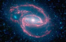
Kino 10 -Research
For the research, I looked at some galaxies and orbs form and colours to see what they looked like and the colours, most of them had a blue toned to it (cooler) which is why I changed from the red (warmer) colour at first to the cooler colour.


I love how they all seem to have like a form or pattern and the colours around them and the glow. the black background makes the colours pop out more which is why I thought black would be better so the audience dont have to focus everywhere but jus at the right place.


Thursday, 15 March 2012
Kino 10 -Making and Tests ( Problems )
I had problem with my animation when it comes to rendering. It was skipping some frames at the exact place every time i render the animation out to quicktime player.
At first I thought it was some frames that had been messing up the render settings and makes it skip some frames, but i looked at one layer after another and its keyframes to see the problems, did not see anything. When I ram preview it, everything worked fine only when I render out it skipped.
I asked my class mate Keanu for some help, he has a better knowledge of after effects than me,even he couldn't figure out what it was. I was stuck and few days left to deadline and I can't submit an animation like this.
Finally with help of my tutor Kelvin, he figured it out that it was the Camera that caused it, the camera stopped at the moment of the frames skipping. To fix this, he extended the camera to the end of the animation which then worked fine.
Lastly I would like to thank Keanu and Kelvin (tutor) for taking their time to help.
Kino 10 -Making and Tests


Transition Research


So I saw some Tutorials for transitions and one of them had this simple fade out with cloudy look to it, I thought this would blend in well with my animation transition

Subscribe to:
Posts (Atom)